Presenting AI Data in Graphical Form
Fee: $149 / Online / Sep 25, 2026 / Course Code: 0601-WEB26
OVERVIEW
Please note, This instructor-led course has specific dates and times:
This webinar is held online on the following schedule (All times in Eastern Time Zone): 12:00 pm to 1:30 pm Eastern
After participating in this webinar, you will be able to:
- Understand the importance of data visualization in identifying trends and patterns, and its key role in AI data analysis.
- Identify different types of charts (bar charts, histograms, scatter plots) and choose the most suitable format to present different types of data.
- Familiarize yourself with various data visualization tools and libraries, including popular software like Excel and MATLAB, and learn to use them effectively to achieve visualization goals.
Description
This webinar aims to equip participants with the necessary skills to effectively present AI data in graphical form. We will explore why data visualization is crucial for understanding hidden trends and patterns in complex data. Participants will learn to distinguish between different types of charts and choose the right visualization tool based on their specific needs.
Additionally, a practical introduction to popular visualization software and libraries, such as Excel and MATLAB, will be provided, allowing participants to immediately put into practice what they have learned.
Who Should Attend
It is particularly suitable for those looking to improve their ability to visualize complex data in a clear and understandable manner, an essential aspect in the field of artificial intelligence and data analysis.
- Chemical Engineering
- Civil Engineering
- Environmental Engineering
- General Engineering
- Industrial Engineering
SYLLABUS
- Importance of data visualization
- Understanding trends and patterns - Types of charts and their use
- Bar charts, histograms, scatter plots
- Choosing the right chart for the data - Visualization tools
- Popular software and libraries (Excel, MATLAB
INSTRUCTOR
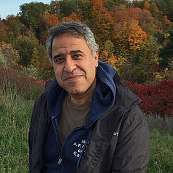
Adjunct professor
Hossein Bonakdari, Department of Civil Engineering, Ottawa University.
Hossein Bonakdari has worked for several organizations, most recently as a faculty member of the Department of Civil Engineering at the University of Ottawa, Ontario. He has supervised several Ph.D. and MSc students with teaching experience of more than 16 years in the field of Artificial Intelligence application in Civil and Environmental Engineering.
His fields of specialization and interest include the practical application of soft computing techniques in engineering problems. Results obtained from his research have been published in more than 300 papers in international journals (h-index=53). He has also had more than 150 presentations at national and international conferences. He published three books. Dr. Bonakdari's exceptional research achievements have garnered global recognition, consistently placing him in the top 2% of the world's top scientists across various fields for four consecutive years (2019-2023).
Dr. Bonakdari is currently leading several research projects in collaboration with industrial partners.
We always want to improve the quality of our courses. Please select any reasons why you feel this course is inadequate (check all that apply).
Thanks for the feedback.
Your input helps us improve EPIC's training programs.
We couldn't record that feedback.
This course's ID doesn't match anything in our records. Please refresh the page and try again, or contact registrations@epictraining.ca.